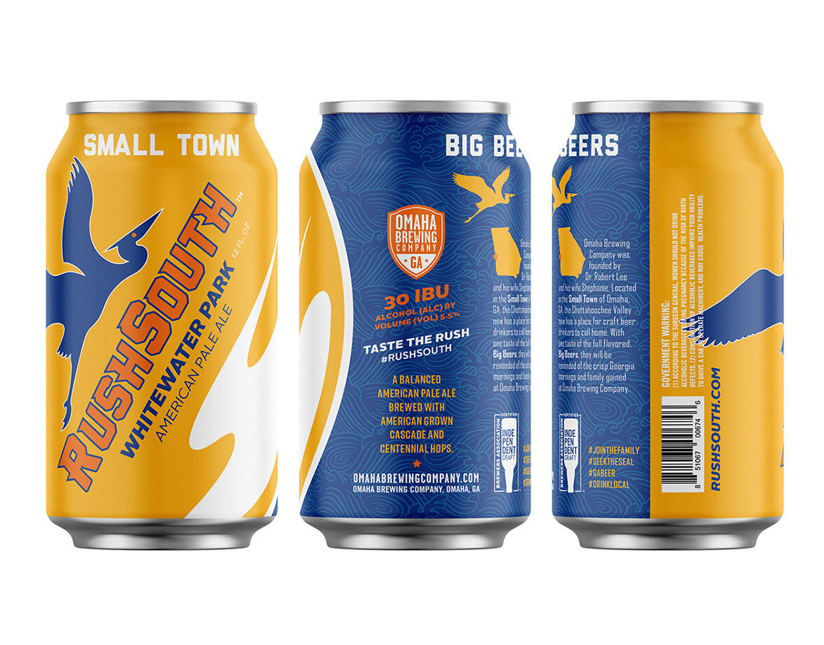
Building the Brand
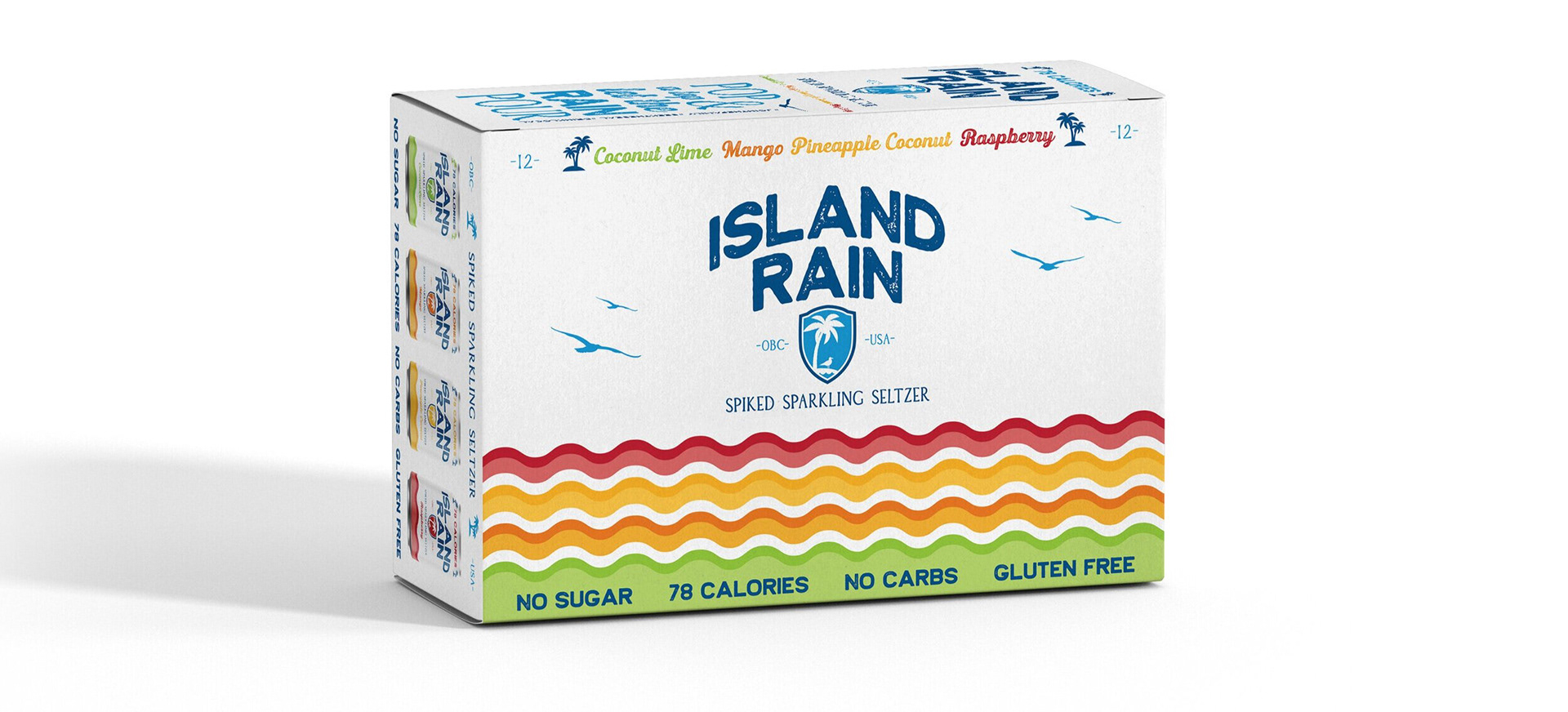
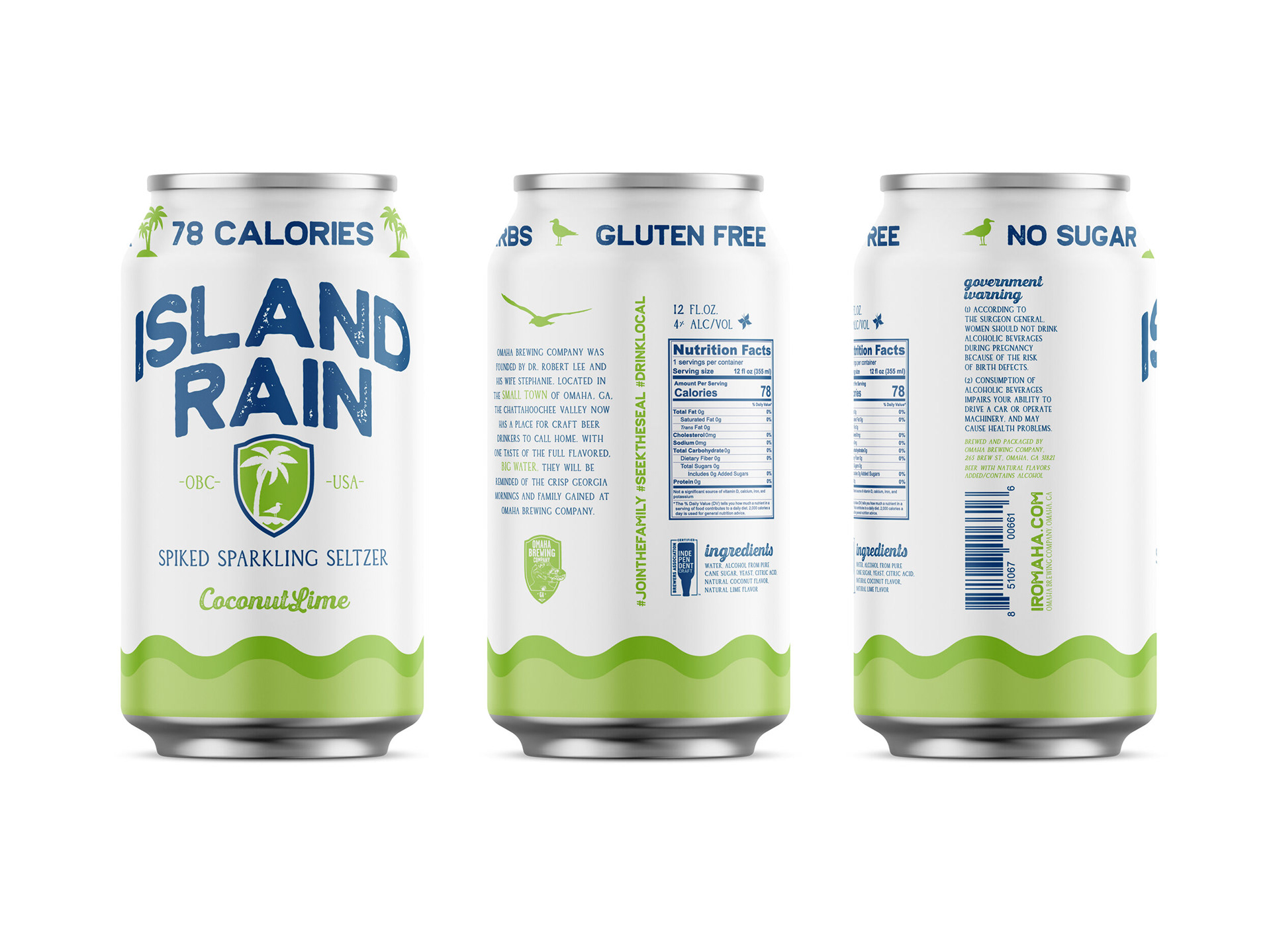
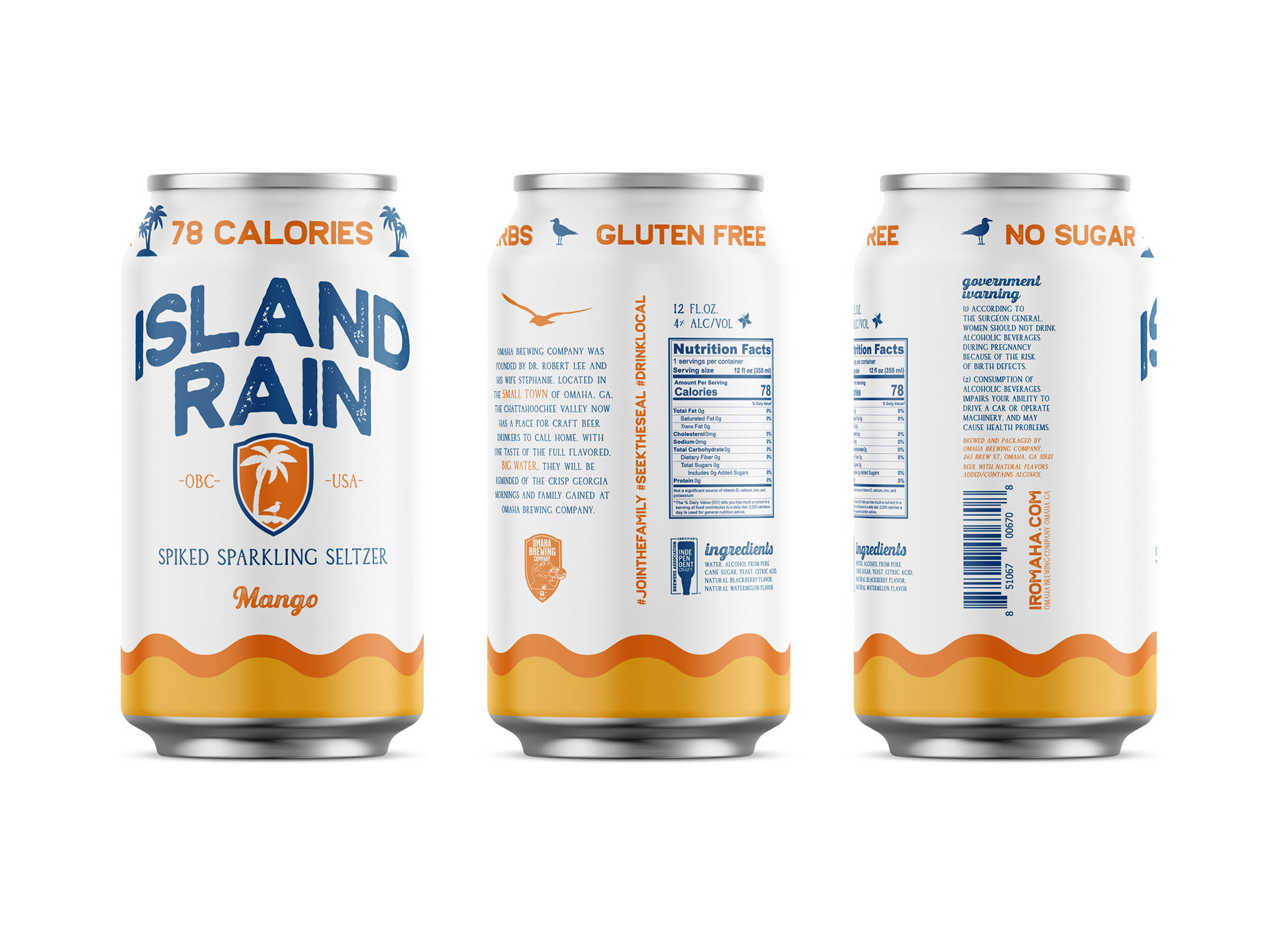
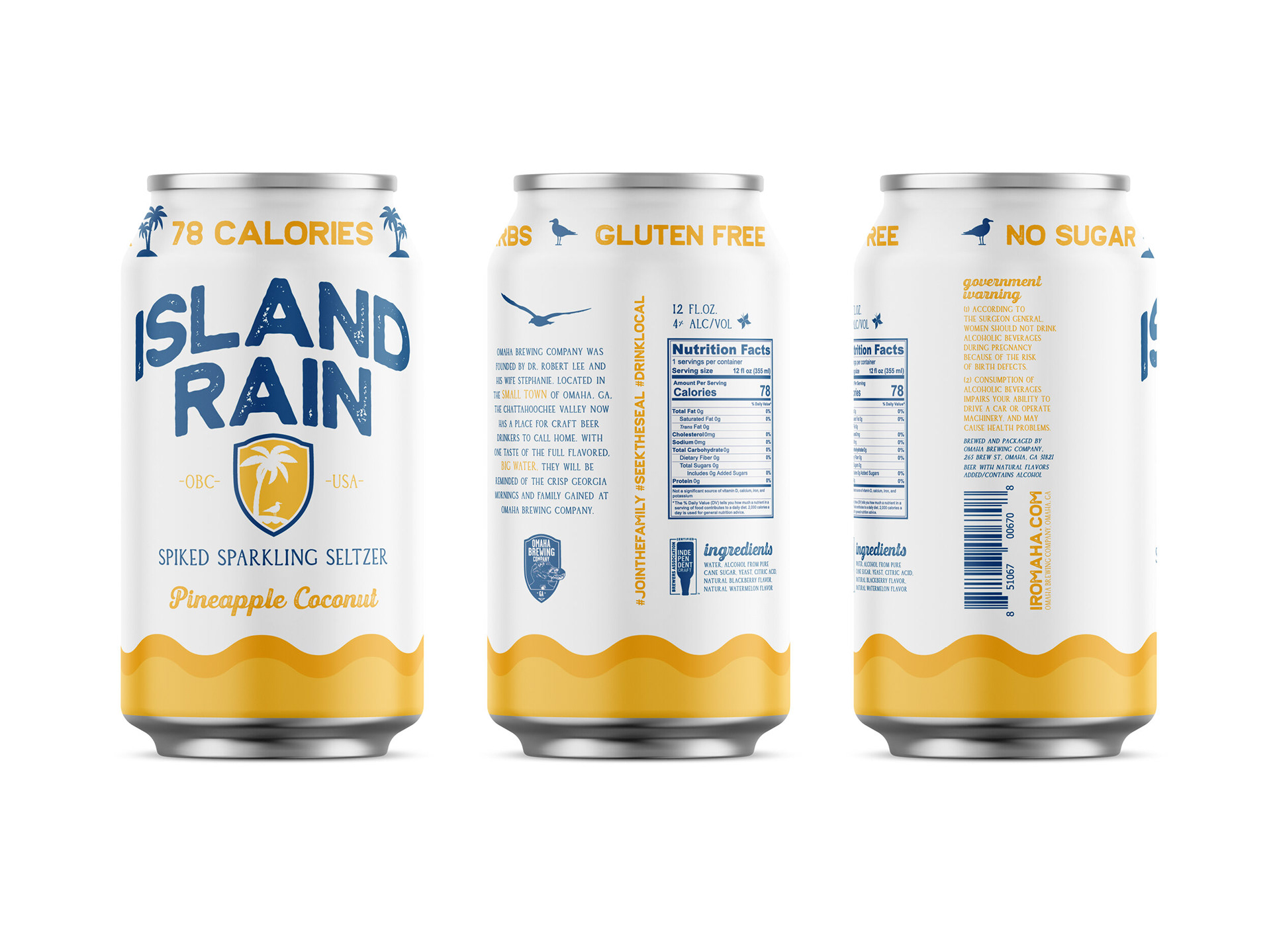
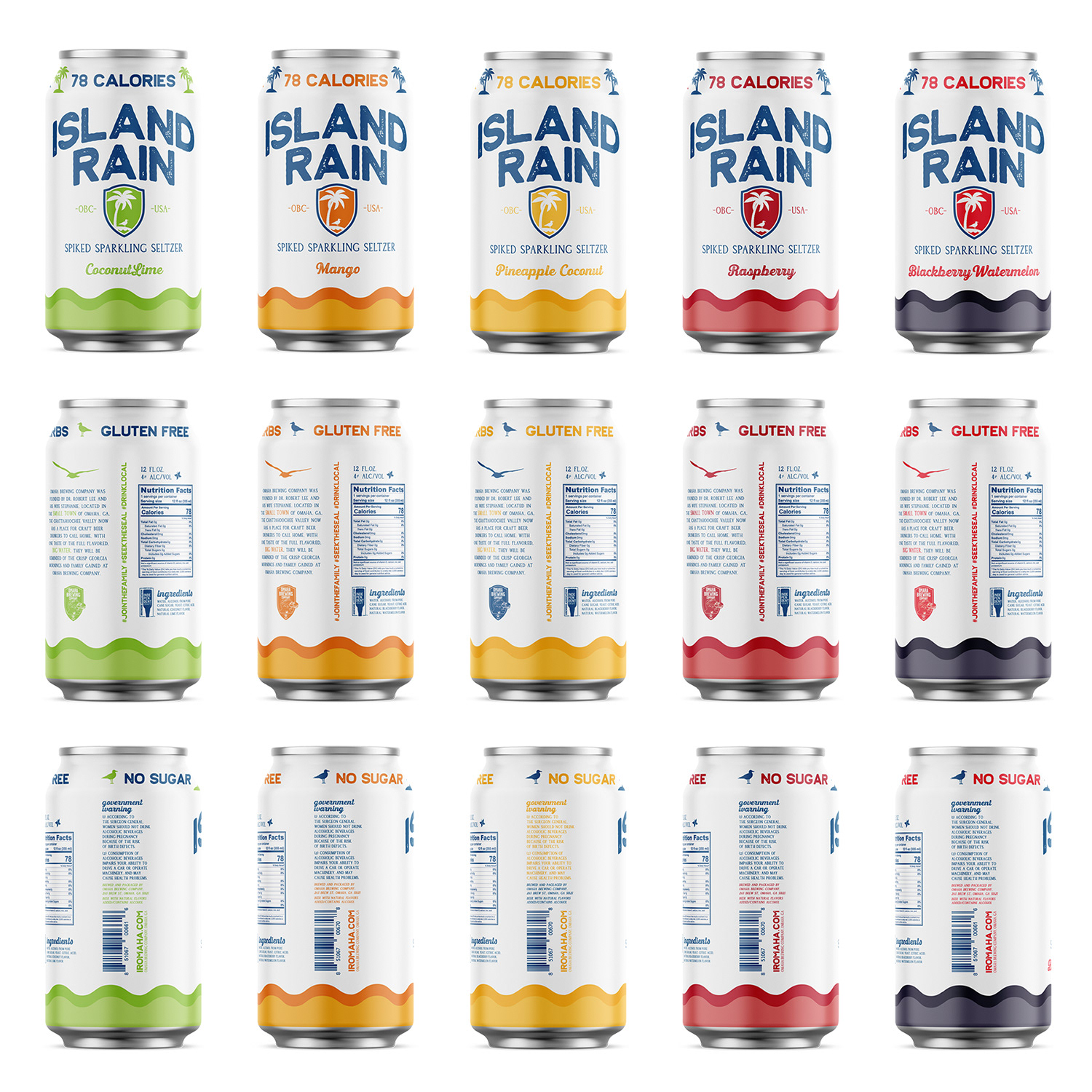
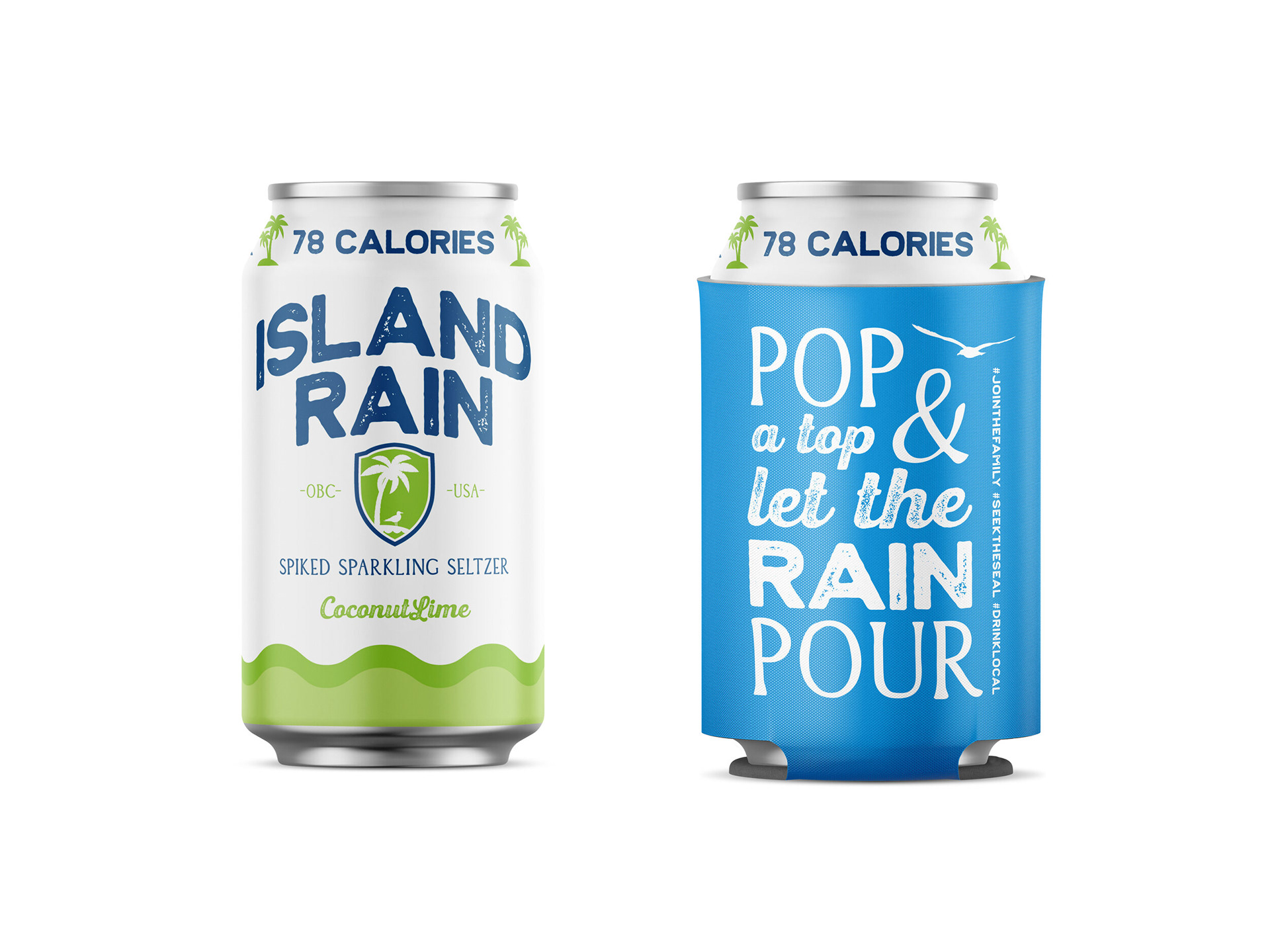
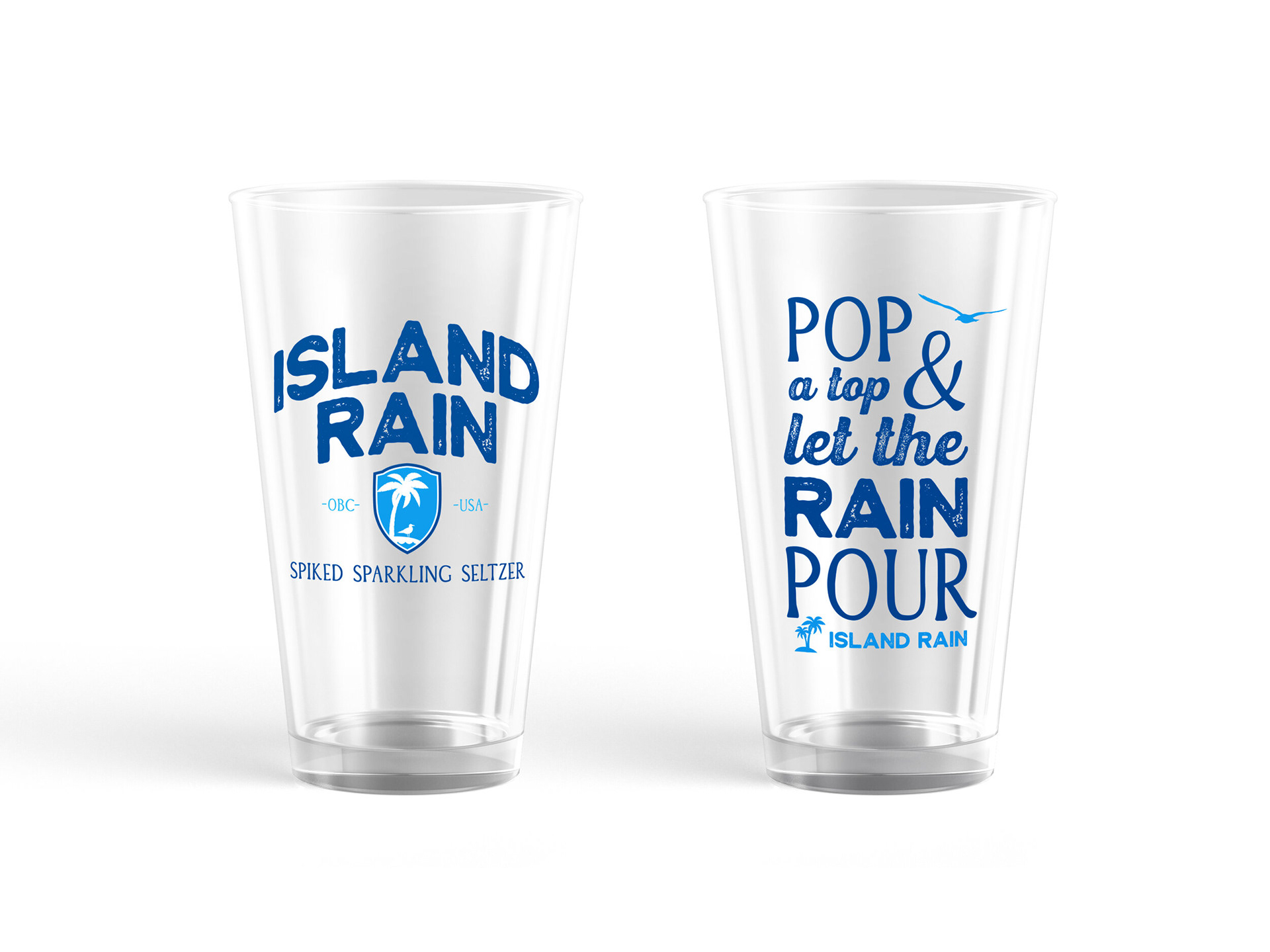
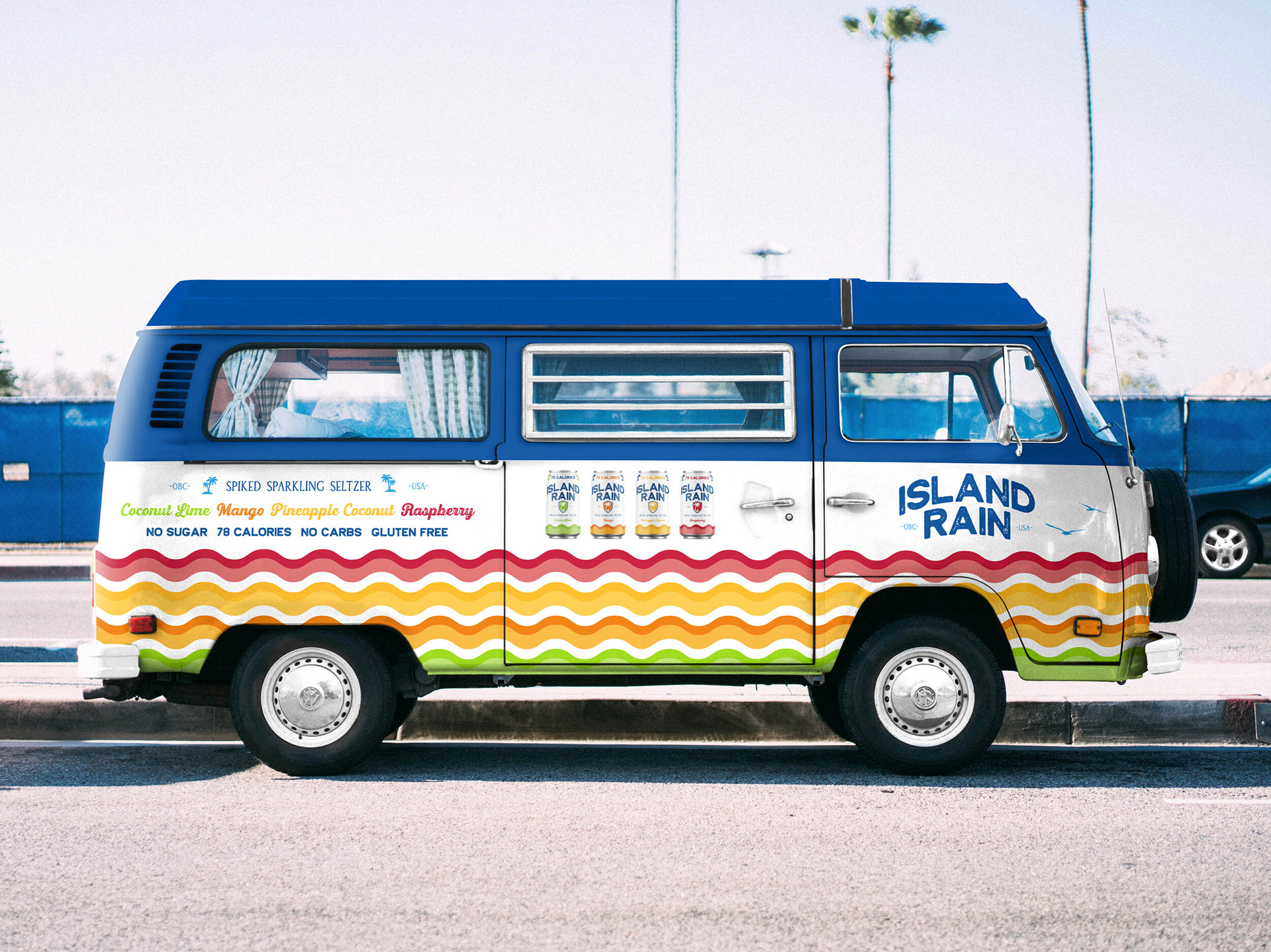
Omaha Brewing Company wanted to make a statement with their new brand for their first entry into the spiked seltzer market. A clean and crisp can design compliments the logo establishing a design language that targets a younger audience and appeals to current enthusiasts. The use of color helps consumers easily identify the five flavors offered.
The minimal use of color, future-proofs the artwork allowing Omaha to move the design onto aluminum substrate once the product is ready for mass production.

Client: Omaha Brewing Company
Awards: 2021 Bronze A' Design Award in Packaging Design, International Design Academy, 2020 GDUSA American Graphic Design Award
Software: Illustrator